Monotype UX Library
I worked with my UX team colleagues to bring our work together, unify design and create a Figma library of guidelines and patterns that would ensure consistency and a better experience for customers online.
Overview
The company behind type
Monotype is a type foundry and home to one of the world’s largest and most comprehensive collection of typefaces. It owns historically significant typefaces such as Helvetica and Gill Sans and new contemporary font releases like Masqualero and Posterama. It also provides design products, technology and expertise that help brands create beautiful, authentic experiences.
I joined the company after the design studio I worked for was acquired to form the company’s in-house digital design team in 2014.
The challenge
Distributed design
At the beginning of 2019, all UI/UX designers across the company were bought together into one UX Design team. We brought with us the many projects we had been working on and for the first time were given time and space to work on unifying design across all websites, products and services.
As with most large companies with many products, historically designers had worked to tight deadlines developing features and having to make quick design decisions. With us now all on the same team we could finally stop and hold all our work up for comparison and evaluate where we had shifted in different directions.
The audience
Across websites, products and services
This was the first time we got to think about the broad range of customers across all products. We also had the opportunity to map the user journeys from email, to the marketing website, to purchase, and finally into the product.
My role
I worked as a Senior UI/UX designer with a team that consisted of four other designers. We bought our work together for regular catchups each week, plus offsite intensive weeks where we would work on bigger issues that required more collective thought.
How we got there
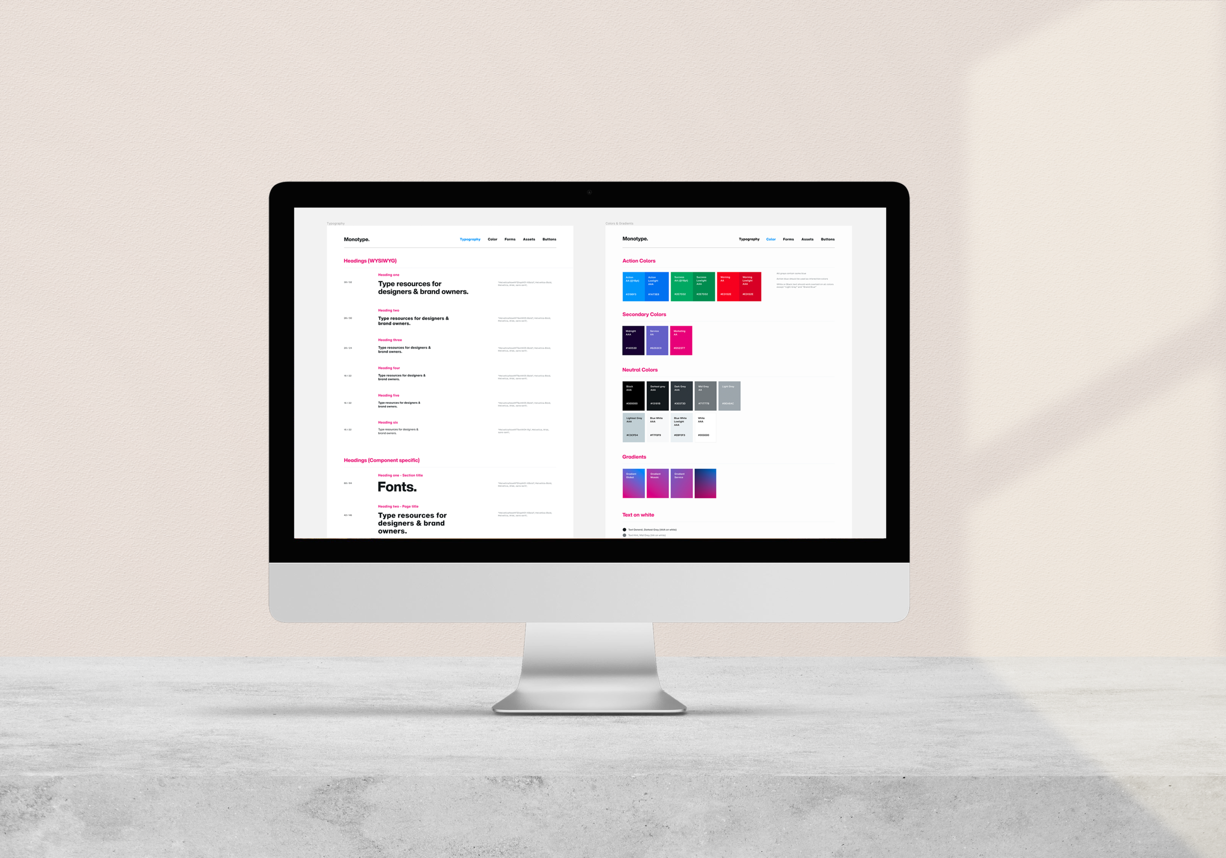
A design system in Figma
As we bought our work together for audits and analysis we could quickly see the areas which we could quickly solve and have the greatest impact. These were elements such as colour; we unified the brand blue used across the company, plus all the secondary and interactive colours. We also implemented consistent forms so that users would know what to expect wherever they filled a form out across products.
We also unified typography, creating reusable typographic scales, and usage rules. As we were already all working there it made sense for us to house these styles and patterns in Figma where they could be easily reused and remove the chance for any further deviation moving forwards. Having these files also allowed any contractors working on projects outside of our remit to create a new Figma project and have access to all our patterns and styles.
Outcome and learnings
Unified teams and design
Our team all agreed that working this closely and bringing all our projects together not only improved design but also allowed us more time to be creative as we knew that type scales, forms and colours were all solidified. Our team and anyone external could create consistent work with a strong base knowing it would be on-brand. We could also work quickly when needed, building on our already strong guidelines.